Overview
Originally formed almost a century ago, Herkowski Stickler & Associates (HSA) services the plumbing industry as a manufacturer’s representative. Located in Wisconsin and Illinois, they service those states by providing first class sales, service, and training to architects, engineers, and mechanical contractors.
Visit WebsiteThe
challenge
Designed by Leaf Design, the previous HSA website simply provided a point of presence online (as it was originally intended). It included some outdated facts about the company, and provided a simple list of manufacturers. Beyond that, it did not contain much valuable content, nor did it focus on generating new business.
Now almost 8 years old, the previous website had significant untapped potential from a digital marketing standpoint. Some of the current website’s shortcomings included:
- A dated visual design
- A lack of details on product lines and information
- Ineffective calls to action resulting in negligible leads generated
- Web pages that are not usable by visitors using mobile devices
- A fairly rigid and limiting content managements system
The
process
With an existing set of corporate colours, HSA had a great palette with which to work with. The goal was to design a flexible set of page layouts that were bright and utilized whitespace effectively.
Because very little content had been prepared in advance for the website design process, the layout we conceptualized needed to have a decent amount of flexibility to handle content that varied – both in terms of type and length. Shorter pages with very little product photography needed to still look visually appealing.
What was equally challenging during the design process was the fact that HSA itself was undergoing a fairly radical transformation. Throughout the course of the project, the number of manufacturers doubled in size. This not only affected the scope of the work, but also had an impact on the menu design, footer design, and some index page layouts.
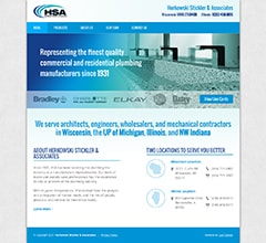
1. Original website
The previous website was intended to act as a simple online brochure, with little focus on generating new business.
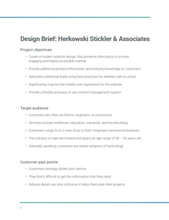
2. Design brief
To ensure a successful design process, a design brief was generated to capture the client's objectives and preferences.

3. Initial concept
The initial concept for the Home page was initially location-focused, with manufacturers and benefits being secondary.
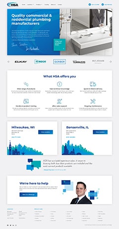
4. Final design
The final design of the Home page involved re-arranging the core content elements and cleaning up some of the design elements.
The
solution
Multiple locations
Throughout the design, we made sure that the two available locations (Wisconsin and Illinois) were obvious to all web visitors. Not only are the two locations geographically different, they also carried different product lines. As such, information about the various manufacturers needed to be split by state, to avoid any false promises.
Both locations contact information is contained in both threader and footer of all pages of the website. On the manufacturer index page, the available locations are shown via small location checkmarks. Clicking through to an individual manufacturer page, also indicates which locations the product line is offered at.
Given the number of manufacturers in both locations, a mega menu format was used for this section of the main navigation. This allows visitors to see the product lines offered at each location at a glance, without needing to drill down into submenus.
Flexible pages
The custom WordPress back-end interface that was built for the client allowed for a very flexible design for all of the pages. This is most noticeable on the individual manufacturer pages, where some pages included a significant amount of content and imagery, while others were more sparse due to limited product information from the manufacturer.
A personal approach
A major part of the HSA’s success is the people that they hire. With most clients interacting with their sales reps on a daily basis, we ensured that the HSA team was featured throughout the new website. The About Us page, along with the individual Location pages showcases the appropriate team members and their various roles.
The call to action blocks were designed to incorporate an isolated photo of a random team member on each page load. This added a personal touch to these elements, while allowing for some visual variety for visitors.
One of the limitations that we encountered early on was an incomplete collection of the team’s corporate headshots. It was determined that the best course of action was to setup professional headshots for all team members. With the sales team being spread out across two states, this made for a more challenging approach to photography. But in the end, a level of consistency was achieved allowing for a professional appearance.


