Overview
Thorcan is a Canadian industrial contracting and engineering firm specializing in refractory construction. Although large in size, they are also a flexible organization providing solutions for a variety of industrial projects.
Visit WebsiteThe
challenge
Thorcan was aiming to grow their business and market share in an effort to surpass their main competitor. One avenue of growth that was identified was the company’s online marketing, which naturally includes their corporate website.
The previous website acted as an online point of presence (as it was originally intended). However, there was significant untapped potential from a digital marketing standpoint. Some of the current website’s shortcomings include:
- An overly simplistic design that didn’t match the firm’s professionalism
- A disconnect with newly developed corporate branding and messaging
- A lack of details on service offerings and industries covered
- Ineffective calls to action resulting in negligible leads generated
- The inability to make basic edits to the website’s content
The
process
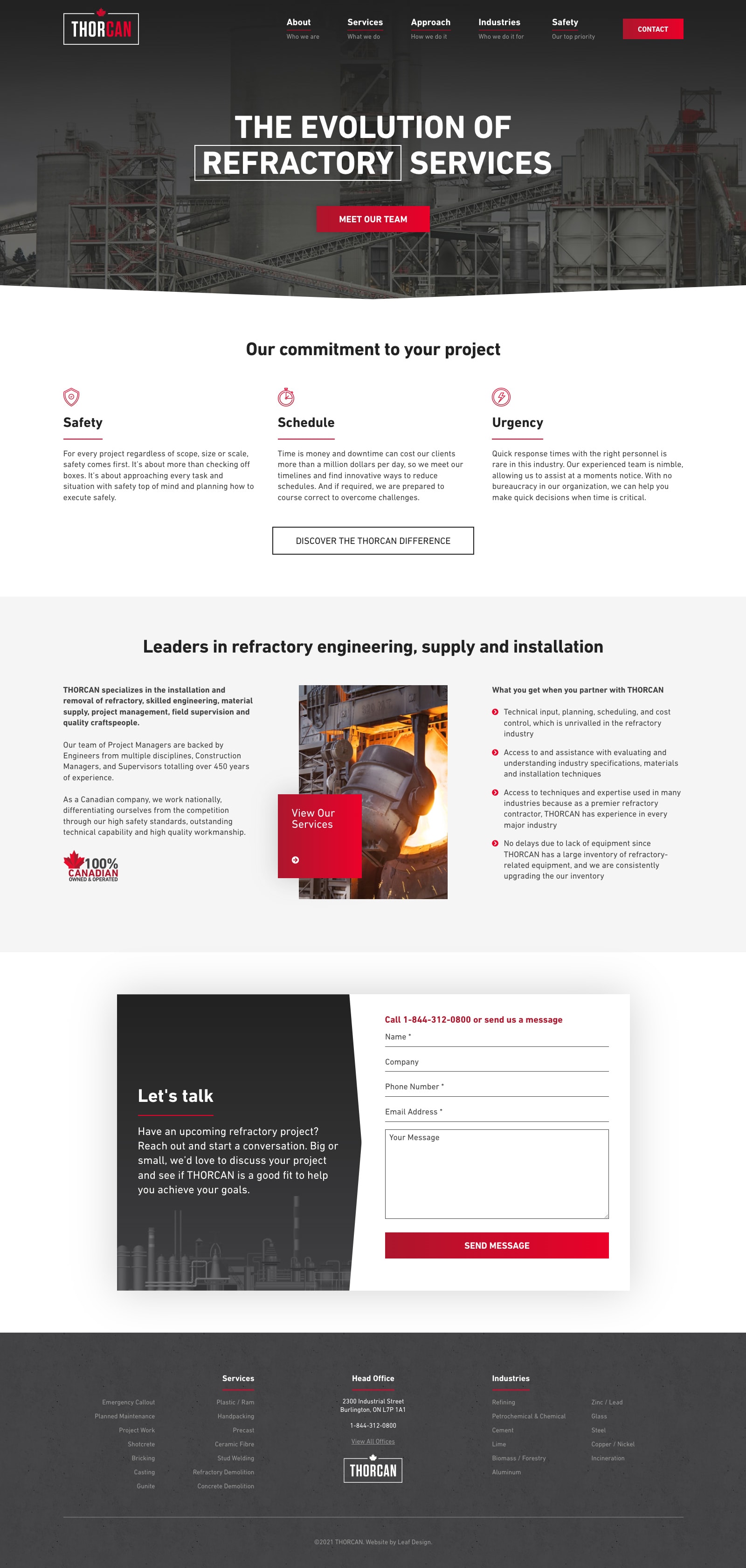
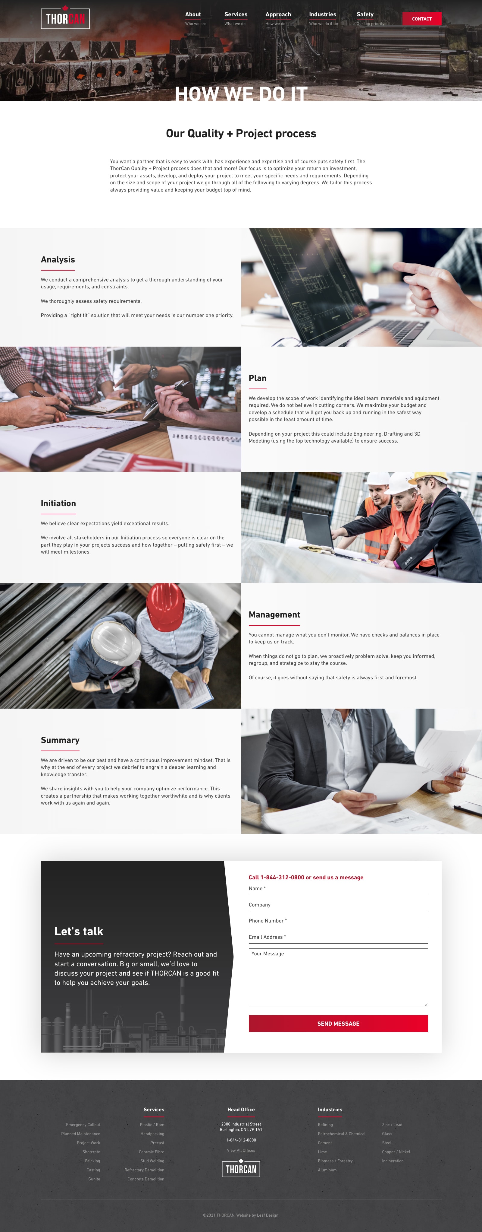
Having just completed a corporate re-branding exercise, the design parameters for this project were well defined. Succinctness was a top priority as the client was not looking for lengthy content pages, but rather short and concise overviews.
The general tone of the design was requested by the client to have a dark, gritty, industrial feel to it. Thankfully, the client’s black and red corporate colours worked wonderfully for this style.
While some stock photography was required, where possible, the goal was to utilize the client’s own image assets, as much of the construction work performed is unique to the refractory niche.

1. Design brief
Having just completed a corporate re-branding, the team was well prepared to incorporate the refreshed corporate identity and vision to create a solid design brief.
2. Wireframe
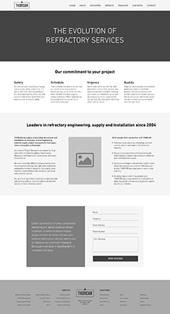
The goal of the Home page was to keep it fairly concise –. a key pillar of the new corporate communication guidelines.

3. Initial concept
The initial concept resonated with the ThorCan team immediately as Leaf Design captured the overall dark, industrial vibe the client was aiming for.

4. Final design
Only a few minor adjustments to headings, calls to action, and content blocks were required to finalize the new Home page design.
The
solution
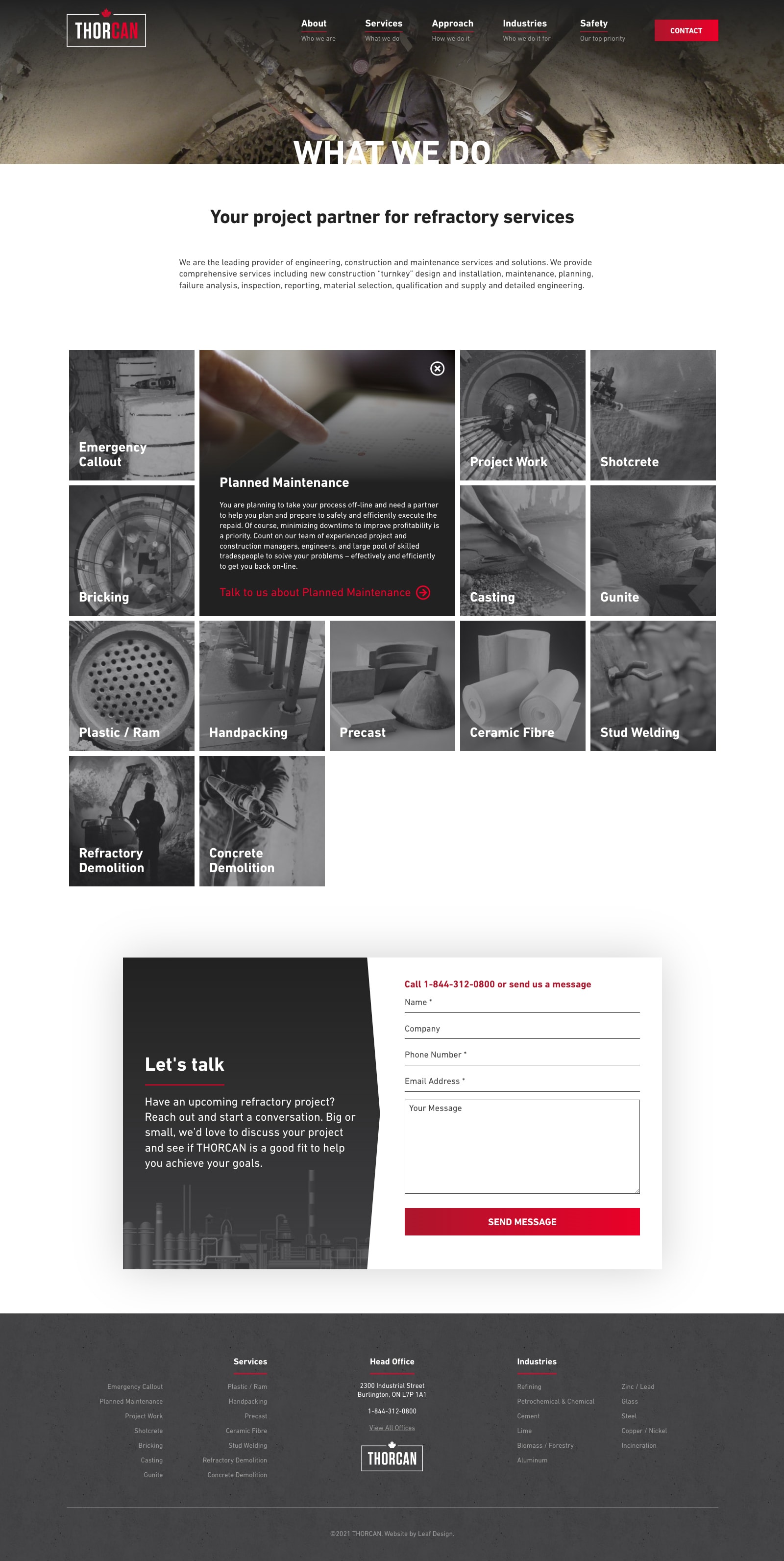
Streamlined content
The previous iteration of the ThorCan website included individual pages for each and every service offered. While this is generally a recommended approach, it only works when there is sufficient content to warrant individual service pages.
However, much of what was written on each page amounted to only a couple of lines of text. This resulted in visitors having to load many service sub-pages just to get an overview of ThorCan’s service offerings.
The new site design – especially the Services page – focused on displaying only the most relevant information as efficiently as possible. To accomplish this, short, easy to read content sections were utilized. Imagery, icons, and other graphics were used to help illustrate points, while maintaining the new corporate branding guidelines.
A personal approach
Although the construction industry ultimately builds physical “things”, it is still a people-first business. Solid relationships need to be formed at the start of the project to ensure success with clients. By hiring the top minds in refractory construction, they are proud of their team.
The new website was a great opportunity to open up access to their management team. The company’s About page incorproates headshots, contact information, and short biographies for all of the key employees. Not only does this format help potential (and current) customers, it also assists with new hiring efforts.
As well, a separate panel introduces the CEO, Neil Lawson, showing the ethos that he stands behind.
Animated elements
To provide a more premium feel to the user experience, Leaf Design incorporated some subtle animations within key design elements. Although not overly complex, they help provide a more upscale feel to each page load. The key is to ensure that the animations do not hinder or slow down access to the information that the visitor is looking for. And it’s important that the animations themselves don’t overshadow the content that users are there to read.