


A commercial construction company came to us after their previous web design team gave them their first look at the new site about a week before launch. The design had missed the mark badly, and with the launch only days away there was almost no room to fix it.
Ultimately they had no option other than to push the launch date back. Every piece of feedback then had to be applied across all pages and templates that had already been built.
The problem in that story was mostly the process. It kept the client in the dark until the work was finished, which is the worst possible moment to discover it isn’t right. How an agency shows you the work in progress decides when you get to have a say, and it’s worth asking about before you sign anything.
What a static mockup shows you, and what it hides
A static mockup is a picture of a web page. For years it was how most agencies (including ours) presented design concepts. A designer would lay out each page in Photoshop (or, these days, often Figma), export images, and send them over for comment. Once the client approved them, a developer would turn that layout into actual code for the website’s pages.
A mockup is good at showing colour, typography, and the general arrangement of a page. It is much worse at showing you what you will live with once the site is running:
- How it behaves on a phone. A mockup is usually a desktop layout. Mobile versions tend to come later, after the desktop design is signed off.
- How it responds when you use it. Menus, forms, hover states, and sliders are described rather than tried.
- How your real content fits. A headline that looks tidy in placeholder text can wrap onto three lines once your actual product name is inserted.
- How fast it loads. An image file tells you nothing about page weight.
The bigger problem is timing. In a mockup-first process, the step where you approve the pictures and the step where you see a working site can be weeks apart. Anything the mockups couldn’t show you surfaces late, when it is most expensive to change.
What we mean by a working prototype
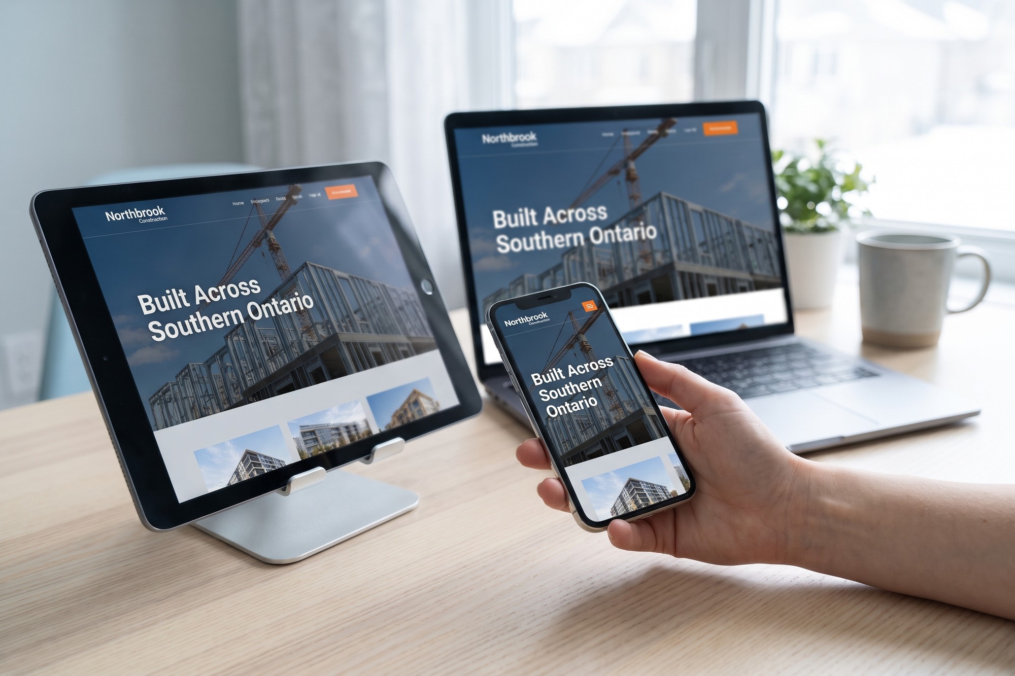
A working prototype is the website itself, built in the real content management system from the first page onward. Instead of a JPEG, you get a link. You open it on your laptop, then on your phone, then you pass it to a colleague who reads it on a tablet.
It is not a completely finished website. Early on it might be just the homepage and two inner pages. And expect to see lots of “lorem ipsum” placeholder text at this stage. But everything you see is the actual site, not a drawing of it, so nothing has to be translated into code later.
Why we stopped designing in Photoshop
We fully moved away from Photoshop mockups about 3 years ago. Before that, our process looked like the one described above. We designed page layouts in Photoshop, and once they were approved, we coded them by hand into a custom WordPress theme and its template files.
What pushed us to change was something we call the change-it-five-times problem. A client would ask for a small adjustment to a single element, such as the spacing on a call-to-action panel. In Photoshop, that one request could mean manually adjusting dozens of layers to keep everything aligned. And if that panel appeared on five page mockups, we made the same change five times, then once more in the code.
When we started working with the page builder we now use (YOOtheme Pro), we quickly realized it was easier to mock up a page in the builder than in Photoshop. A change to a shared element happens once. Global settings can be applied instantly to all design elements as desired. The code is written as the page is designed, so there is no separate step where the design is rebuilt by a developer and something gets lost in translation.
As an aside, yes, we are aware that other tools such as Figma can speed up the revision process. Figma allows for styles so you can save and reuse properties like colours, typography, and effects, but we simply chose to skip that workflow and craft pages directly in the page builder.
We would add one honest caveat. A page builder is not automatically better than a design tool. It suits the kind of sites we build, which are marketing sites for B2B companies, and it suits our process. We take a different approach when building a complex web application.
A Working Prototype Shows
- The real layout on your own phone
- Menus and forms you can try
- How your actual content fits
- Progress every week, not at the end
A Static Mockup Leaves Out
- Mobile, usually until later
- Anything you would click or tap
- Real headlines and copy lengths
- How the finished code behaves
What changes for you as the client
The biggest change is that you see the work while it is still easy to change. Rather than waiting for a reveal, you get an updated link roughly once a week, with a short note on what was added or changed since the last iteration.
That approach accomplishes two things. Problems surface early, while they affect one page rather than thirty. And feedback stays small, because you’re commenting on a week of work rather than months of it.
The second change is the one clients tend to notice first. You can look at the site on your own phone from the get-go. With static mockups, clients only had a desktop layout to review, and we would explain that the mobile-friendly versions would come later in the process.
Some clients understandably didn’t want to wait that long to see how the site looked on the device many of their visitors use. A working page answers that question on day one, on every device anyone in the company owns.
The Weekly Review Cycle
Build
- Pages added in the real site
- Shared elements changed once
Share
- An updated link
- A note on what changed
Review
- On laptop, tablet, and phone
- One list of comments
Adjust
- Small fixes, made early
- Before they spread
This connects to a broader point about what to expect during a redesign. The six stages don’t change, but the Visual Design and Site Development stages overlap far more when the design is built directly using the page builder. You are effectively reviewing both at once.

The trade-off: a site that is visibly unfinished
Working prototypes have a downside, and clients run into it quickly. We often build a fully working main menu while only a few of the pages behind it exist yet. Clients inevitably click a link, land on a missing page, and wonder whether something is broken. The same happens with buttons and in-text links that haven’t been connected yet.
It is a reasonable reaction, and it is the price of seeing the real thing early. A mockup never has broken links because it never has links at all.
The fix is mostly about framing each review. A few habits make demo links far easier to give feedback on:
- Read the notes before the link. Each update should say which pages are ready for review and what updates have been made. That way your team can focus on reviewing the changes that matter most.
- Review on the device your buyers use. If most of your enquiries come from people on phones at a job site, look at it on a phone first.
- Comment on what’s there, not what’s missing. An unbuilt page will eventually be built, so don’t worry about that. However, a layout you don’t like on a finished page is worth raising with the design team now.
- Send one consolidated list. Gather comments from colleagues before sending them, so the team isn’t reconciling three opinions related to the same content panel.
- Flag content gaps separately. Placeholder text is a reminder that copy is due, and content is what usually stalls a project.
Where a mockup still makes sense
We haven’t abandoned static images entirely. For small revisions to a page, we will sometimes put together a few quick Photoshop mockups and send them as screenshots. This is usually when we have a handful of ideas for a single design element and want the client to be able to easily compare them side by side.
That’s the one thing a working prototype does poorly. A live page can only show one version of an element at a time. We’ll sometimes temporarily place three versions of the same element on the page for comparison purposes, but that can sometimes lead to confusion among clients who don’t understand why we’ve done that. In contrast, three images in an email let you compare three options in seconds.
The tools are also moving. Figma, a design tool widely used for mockups, has started letting designers publish live websites directly through a product called Figma Sites, which its own help documentation still labels as a beta. The line between a design file and a website is getting thinner, and the question worth asking any agency is less about which tool they use and more about when you’ll first see something you can click.

Questions to ask before you hire
If you’re choosing an agency, ask how they present work in progress. The answers tell you a lot about how the project will feel:
- When will I first see something I can open on my phone?
- How often will I see updates, and in what form?
- If I ask for a change to a shared element, how many places does it need to be made?
- What happens to the schedule if the first design direction isn’t right?
None of these has a single right answer. But an agency that can’t tell you when you’ll first see a working page is describing the process our construction client went through, and it’s worth knowing that before the contract is signed.
Click it before you approve it
A picture of a website asks you to imagine the rest. A working page lets you stop imagining and start using it, on your own phone, weeks before launch, while changes are still cheap.
If you’re planning a redesign and want to see how this works on a real project, book a discovery call. It’s a useful conversation about your site and your buyers, with no pitch, and no pressure.


