Most websites are built as though every visitor has arrived ready to buy.
That assumption works well enough for a consumer brand selling running shoes or a weekend getaway: someone sees it, wants it, and checks out a few minutes later. But if your company sells to other businesses, that same model works against you. A B2B website built on a retail playbook can look perfectly professional and still fail at the one job that matters most: turning a serious, research-minded buyer into a qualified lead.
The difference between a B2B and a B2C website isn’t cosmetic. It runs all the way down to how the sale actually happens: who is involved, how long it takes, and what a buyer needs to believe before they are willing to start a conversation. Get that wrong, and no amount of polish will save the site. Get it right, and your website becomes one of the hardest-working members of your sales team.
Here is what separates the two, and what it means for the way your site should be built.
A business purchase is a fundamentally different transaction
In business-to-business sales, fiscal responsibility trumps emotion. There is rarely an impulse buy. A purchase has to be justified, budgeted, and often defended to other people. That single fact reshapes everything about how your website needs to work, and it shows up in four distinct ways.
The purchase cycle is long and considered
A consumer might decide on a product in minutes. A B2B buyer is working on a timeline of weeks, months, and sometimes years. They will visit your website many times across that period, at different stages of their thinking, and often long before they are ready to talk to anyone.
That means your site can’t be a single pitch aimed at someone ready to sign today. It has to serve the person just starting to understand their problem, the one comparing three vendors, and the one building the internal case to move forward, sometimes all in the same week. Each of those visitors needs something different. The early researcher wants to understand their options. The one comparing vendors wants specifics and proof. The near-buyer just wants reassurance and an easy way to take the next step. A website that only speaks to the ready-to-buy visitor loses everyone who isn’t there yet, which is the overwhelming majority of your traffic.
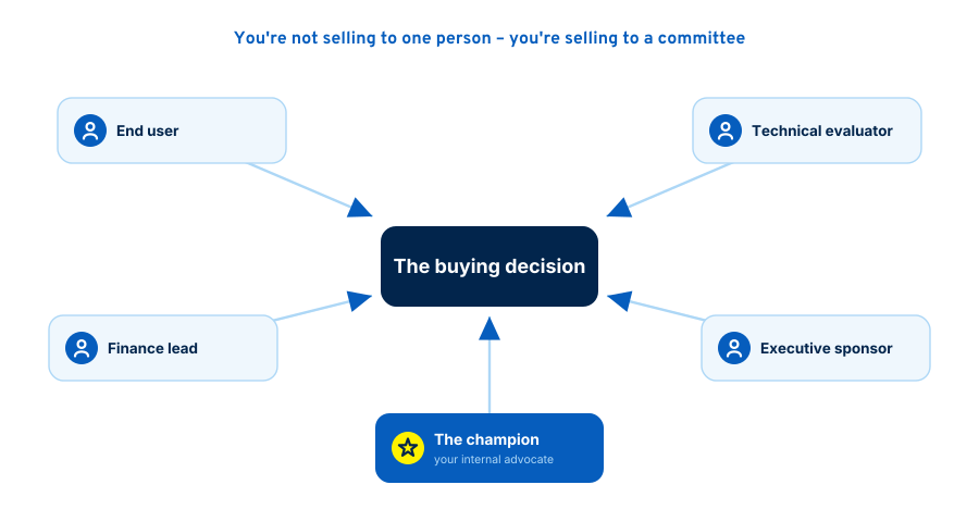
You are selling to a committee, not a person
This is the difference most retail-style websites get most wrong. Consumer purchases usually have a single decision-maker. B2B purchases commonly involve several stakeholders across an organization, each with their own priorities, and any one of them can slow a deal down or stop it entirely.
Picture the group that has to say yes to a typical B2B purchase. The person who will actually use what you sell wants to know it will make their day-to-day easier. The technical evaluator wants to know it will integrate with existing systems and won’t create headaches. The finance lead wants to understand the cost, the risk, and the return. The executive sponsor wants to know it supports a bigger objective they’re accountable for. That is easily half a dozen people, often more, and they rarely sit in the same room at the same time.
Your website has to speak to all of them, because you usually can’t control which one lands on which page. And there is one member of that group your site has to serve above all others: the champion. This person discovered you, believes in what you do, and now has to sell your solution internally on your behalf – in meetings you’ll never attend, in threads you’ll never see. When they forward a link to their CFO, that page has to answer the CFO’s questions on its own. If it doesn’t, the momentum you worked to build dies quietly in an inbox, and you’ll never know it happened. A great B2B website is a tool that helps your champion win the argument for you.
Pricing is complex, not a number on a tag
In retail, the price is the price. In B2B, pricing is usually customized to each client’s needs, quantities, and specifications. That creates a real design challenge: buyers want a sense of cost, but you often can’t publish a single figure without misleading them.
Handled poorly, this becomes a black hole where visitors hit “Contact us for pricing” and leave to find a competitor who was more forthcoming. Handled well, a B2B site gives buyers enough to qualify themselves: typical ranges, the factors that move a quote up or down, what’s included at each tier, and what a project or engagement actually involves. You don’t have to publish a firm number to be useful. Explaining how your pricing works, and being honest about what drives it, builds far more trust than silence ever will. It also does you a favour by filtering out the prospects who were never a fit, so the ones who do reach out are closer to the mark.
You may need to speak to several audiences at once
Many B2B companies sell across a range of industries and use cases, and a single website has to demonstrate value to all of them without becoming a bland, generic blur. Sometimes those audiences are strikingly different from one another.
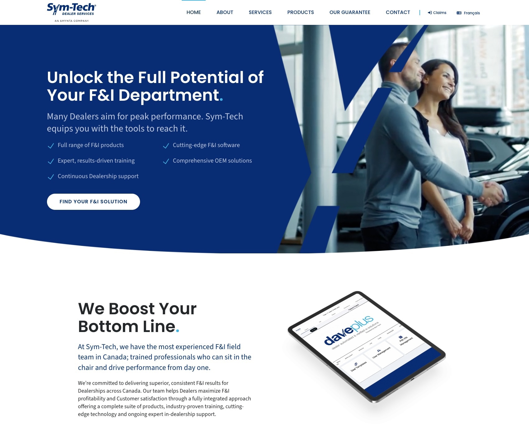
Consider a project we worked on for Sym-Tech, a provider of financial and warranty products to the automotive industry. Their website had to speak to two very different groups at once: the dealerships who sell those products day to day, and the vehicle manufacturers (OEMs) sitting above them. On top of that, it had to serve its content in more than one language. The answer wasn’t to flatten the message into something vague enough to cover everyone. It was to build tailored paths so each audience could quickly find the version of the story that spoke to their situation. That is a distinctly B2B problem, and it almost never has a one-size-fits-all solution. A retail site can assume a fairly uniform visitor; a B2B site usually can’t.
B2B buyers do their homework before they ever contact you
All of this ties back to one fact: modern B2B buyers do most of their research in private, long before they raise their hand. By the time someone fills out a form or picks up the phone, they have usually read your site, compared you to competitors, read a few of your competitors’ sites too, and formed an opinion, all without you ever knowing they were there.
This changes the job of your website completely. It is no longer a brochure that backs up a conversation your sales team is already having; that conversation is now happening on the page, in your absence, with a skeptical and well-informed buyer who is looking for reasons to shorten their shortlist. Almost half of B2B buyers report doing this research on a mobile device, often while at the office, which is why a site that forces them to pinch and zoom is disqualifying itself before it has said a word.
If your website can’t build trust, communicate value, and guide a visitor toward a clear next step entirely on its own, buyers will be gone before you ever knew they were interested. The site has to sell for you when no one from your team is in the room, which brings us to what an effective B2B site needs to do.
What this means for how your site should be built
Once you accept that your website is doing the early selling on its own, the priorities become clear. An effective B2B website does three things, in this order, and the payoff is more high-quality leads.
It builds trust
Enterprise buyers scrutinize everything, consciously and subconsciously. A dated design, a broken page, a slow load, or clumsy copy can raise doubt before a single fact has been read. Fair or not, buyers treat the quality of your website as a proxy for the quality of your business. If you’ve let your site fall behind, what does that say about the rest of your operation?
Trust comes from looking and reading like a company that has its act together: a clean, current design, a message that states plainly who you help and what you do, and a site that works on every device without fuss. This is the foundation. Without it, nothing else you put on the page gets the benefit of the doubt.
It provides proof
Trust gets a buyer to keep reading; proof is what convinces them. Because a B2B purchase has to be justified to other people, buyers are hungry for evidence that you can do what you claim, and the more specific it is, the more it lands.
Proof takes several forms, and a strong B2B site uses more than one. Recognizable client logos borrow credibility in an instant. Case studies show, in detail, that you’ve solved a problem like theirs before. Testimonials bring in a third-party voice, and one attributed to a named person with a real title (a “National Sales Manager at [Company]”) carries far more weight than an anonymous quote. Quantified results, industry certifications, awards, and detailed examples of past work all add to the picture.
Two things matter most. The first is relevance: a buyer wants to see that you’ve solved their problem, for a company in their industry, at their size. Generic proof reassures no one in particular. The second is placement. Proof buried on a single “Testimonials” tab does little; proof belongs where decisions get made: on your service pages, beside your claims, and near your calls to action.
The form your proof takes should match how your buyers evaluate you. When we built the site for Stevenson Whelton, a Toronto law firm (now Whelton-Hiutin Barristers), each lawyer’s profile was given real depth: their education, bar admissions, areas of practice, and a selection of their recent cases. That’s not decoration. It’s precisely the evidence a prospective client weighs when deciding whether to trust a firm with something important. The right proof, in the right place, does the convincing for you.
It establishes authority
The companies that win complex B2B deals are usually the ones a buyer already regards as experts by the time they make contact. Authority is what earns that regard, and the surest way to build it is to be useful before you’ve been paid a cent.
This is what good content is for: resource articles, guides, and clear answers to the real questions your buyers are asking. A site that teaches, rather than only sells, positions you as the knowledgeable partner in the room and pulls in the researchers we talked about earlier, the ones out looking for answers long before they’re looking for a vendor. (This article is an example.)
Done well, this content works two ways. When we redesigned the site for On-Hold Marketing, we brought their previously-buried resources section to the forefront, using useful articles to show the company’s expertise and placing a clear call to action at the end of each one, so a piece that educates a reader also gives them a natural next step toward becoming a customer. Authority built this way is slow to accumulate and hard for a competitor to copy, which is why it’s worth the effort.
Do all three well and the results follow: a steadier flow of better-qualified leads, arriving more informed and further along than a storefront-style site could deliver.
The most common B2B website mistakes
If you want to spot a site that’s treating a B2B audience like a B2C one, look for these patterns. They’re remarkably common, and each one costs leads.
- One generic call to action: A lone “Contact us” assumes every visitor is ready to talk. Most aren’t. A B2B site needs a primary path for the ready buyer and a lower-commitment path (a guide, a resource, a useful tool) for the much larger group still researching.
- No proof, or proof buried at the bottom: If a visitor has to hunt for evidence that you’re credible, most won’t. Proof belongs where decisions are made, not tucked away on a page few people visit.
- A message aimed at no one: In trying to appeal to every possible client, many B2B sites end up saying nothing specific to anyone. Clarity about who you serve and what you solve beats broad, safe language every time.
- Total silence on pricing: Refusing to give buyers any sense of cost doesn’t protect you; it just sends qualified prospects to a competitor who was willing to help.
- Ignoring the mobile experience: A large share of B2B research happens on phones. A site that only works well on a desktop is turning away buyers mid-decision.
- Treating the site as a one-time project: A B2B website that never gets updated slowly falls behind the business it represents. Behind almost every dated design is a dated or non-existent digital strategy.
A quick self-check
You don’t need an audit to get a rough sense of how your current site measures up. Ask yourself:
- If a stranger landed on our homepage, would they know within seconds who we help and what we do?
- Could a champion forward our site to their CFO and have it answer the CFO’s questions without us?
- Is there relevant proof, matched to their industry and size, near the points where we ask visitors to act?
- Do we offer researchers something useful, or only a “Contact us” for people ready to buy today?
- Does the whole thing work cleanly on a phone?
If you hesitated on more than one of those, your website is probably leaking leads you never see.
The real difference is strategy
Strip away the details and the distinction comes down to this: a B2C website is often a transaction, while a B2B website is a relationship built over time with several people who each need to be convinced. It has to earn trust, supply proof, and show real expertise to an audience doing its homework long before they ever say hello.
That’s why a beautiful design, on its own, will not win you business. A modern look is necessary, but it’s only the visible tip of a deeper strategy: understanding your buyers, mapping the site to how they actually decide, and giving each stakeholder what they need to move forward. When those pieces are in place, your website stops being a digital brochure and starts doing what a B2B site is built to do: generating a steady flow of qualified leads.
If you’re not sure your current site is pulling its weight, that’s worth a conversation. Book a discovery call and we’ll take a look at your website, talk through your buyers, and point out where the opportunities are. No pitch decks, no pressure – just a useful conversation.